CATEGORY:
Product Design | UX/UI Design | Web Design | Brand Identity
SECTOR:
PropTech | B2B Services | Property Documentation
ROLE:
End-to-End Product Designer & AI-assisted Developer

Simplifying Property Services | B2B PropTech
Product strategy, UX/UI and AI-assisted product delivery
About.
RedVit is a property measurement and technical documentation company for commercial and residential real estate. It helps property owners, developers and real-estate professionals obtain accurate measurements, floor plans and technical passports for planning and property transactions.
TL;DR
The challenge
Property measurement and technical documentation are highly specialised services, but potential clients do not always know which measurement standard, document or service they need. The original communication lacked a clear hierarchy between service categories, user needs and the consultation process.
My role
As the end-to-end Product Designer, I defined the positioning, information architecture, content hierarchy and visual identity. I designed the complete responsive experience, developed the motion concept and directed the front-end implementation through an AI-assisted coding workflow.
The solution
The final website turns a complex technical offer into a guided service experience. Clear service categories, contextual explanations and focused calls to action help users understand what RedVit provides and move toward consultation without needing expert knowledge in advance.
The outcome
RedVit gained a distinctive and credible digital presence that communicates technical precision without feeling overly corporate. The responsive system, architectural visual language and purposeful motion create a consistent experience across desktop and mobile while making the company’s expertise easier to understand.
Project constraints
The project was designed and implemented independently, without access to large-scale behavioural analytics or formal post-launch conversion data. The case therefore focuses on product reasoning, clarity of communication, responsive execution and the quality of the shipped experience rather than unverified performance claims.
Research & insights.
01 | Target Audience
Primary audience
Commercial property owners and asset managers
Real-estate developers and business-centre operators
Architects, planners and property consultants
Professionals requiring BOMA-compliant measurements and reliable floor-area documentation
Secondary audience
Private property owners
Buyers and sellers preparing for a transaction
Clients requiring technical passports, updated plans or documentation for renovation and compliance
Shared user need
Regardless of professional background, users need to quickly understand what service applies to their property, what documents they will receive and what the next step will be.
02 | Research Approach
The discovery phase focused on understanding how property measurement and technical documentation services are explained across the market and where potential clients are likely to experience uncertainty.
The process included:
reviewing competitor websites and service structures
analysing recurring terminology across property measurement, BOMA services and technical documentation
mapping different property types to relevant client needs
identifying the information required before requesting a consultation
evaluating how trust, accuracy and professional expertise are communicated visually
reviewing responsive patterns for content-heavy professional service websites
03 | Key Insights
Users may recognise the problem without knowing the service name.
A client may know that a property needs to be measured or documented but may not understand whether they need BOMA measurement, a technical passport or another service.
Technical credibility must be visible, but terminology needs context.
Professional language reinforces expertise only when it is supported by clear explanations and concrete outcomes.
Different audiences need different entry points.
Commercial property professionals and private owners approach the website with different levels of knowledge, but both need a direct path from their situation to the appropriate service.
Consultation is part of the product experience.
Because the final scope depends on the property and required documentation, the website should not force users to make a technically perfect choice before contacting the company.
04 | Problem Statement
How might RedVit communicate highly specialized property services in a way that builds professional trust while remaining clear and actionable for users without technical expertise?
The experience needed to answer three questions quickly:
What does RedVit do?
Which service is relevant to my property?
What should I do next?
Result.
01 | UX Strategy
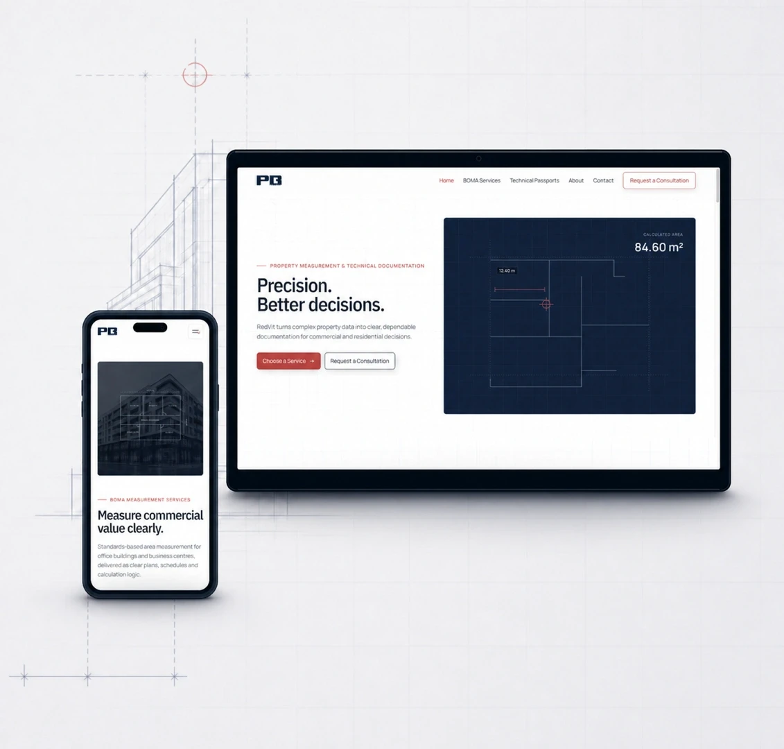
The UX strategy was built around progressive clarity: presenting the essential value first, then introducing technical detail only where it helps users make a decision.
The experience was structured to:
lead with a clear business proposition rather than technical terminology
group services around recognizable client needs
explain expected deliverables and use cases
create consistent consultation paths throughout the website
support both professional and non-expert audiences
preserve clarity across desktop and mobile layouts
02 | Visual Direction
The visual system translates the logic of architectural documentation into a modern digital language. A restrained palette of white, deep navy and measured red accents communicates accuracy, control and professional confidence.

Blueprint grids, measurement marks, floor-plan geometry and technical micro-details create a recognisable PropTech identity. Generous negative space and clear typography balance this technical character, preventing the interface from feeling dense or bureaucratic.
Red is used selectively for decisions and actions, while deep navy anchors technical visuals and creates contrast without relying on a generic corporate-blue aesthetic.

03 | Branding & Logo Design
The RedVit identity was developed from the client’s real working environment. Since Hilti tools are an essential part of the on-site measurement process, their bold, industrial visual language became an initial point of reference.
Rather than adapting an existing typeface, a custom display typeface was designed specifically for the RedVit logo. Its geometric construction, strong proportions and measurement-inspired details reflect the precision and technical nature of the company’s work.
The resulting identity includes a full RedVit wordmark and a compact PB monogram for smaller applications. Together, they create a distinctive and practical brand system that feels professional, recognisable and closely connected to the company’s field of expertise.

04 | Motion & Interaction
Motion was designed as part of the product experience—not as decoration. The interactions reinforce RedVit’s core qualities: precision, structure and confidence.
Purposeful motion
Motion supports hierarchy, explains technical processes and guides attention through complex information.
Spatial depth
Layered parallax connects architectural imagery, measurement graphics and interface content within one visual system.
Interaction feedback
The custom cursor, hover states and transitions make interactive elements easier to recognize while reinforcing the precise character of the brand.
Scroll-driven architectural hero
Layered parallax and depth
Custom interactive cursor
Directional hover states
Progressive content reveals
Smooth section transitions
05 | AI-assisted Implementation
The website was implemented through a prompt-directed, AI-assisted development workflow. Rather than generating a finished template, each section was defined, reviewed and refined individually — from layout and responsive behaviour to animation timing and visual details.
Design direction and product decisions remained fully human-led. AI was used as an implementation partner to translate defined UX/UI decisions into working front-end code, accelerate iteration and explore interaction alternatives.
The process included:
defining the purpose and behaviour of every section
translating layouts into responsive components
directing animation logic and timing
testing desktop and mobile states
reviewing generated code and identifying visual inconsistencies
repeatedly refining prompts and implementation until the result matched the intended experience
This approach allowed the project to move from design concept to a functional, responsive website while preserving deliberate control over the brand, UX and interaction quality.
06 | Outcome
RedVit evolved from a traditional service website into a clear, distinctive digital experience that communicates technical expertise without overwhelming the user.
The final system brings together:
A clearer service structure
A more recognisable brand identity
Responsive desktop and mobile experiences
Purposeful motion and interaction
A scalable foundation for future services and case studies
07 | Key Learnings
The project demonstrated how AI-assisted development can support a designer-led process without replacing design judgment. Every section, interaction and visual decision was individually directed, reviewed and refined to maintain consistency across the experience.
The most important challenge was balancing expressive motion with clarity. Animation needed to communicate precision and technical expertise while keeping the website accessible, responsive and easy to navigate.